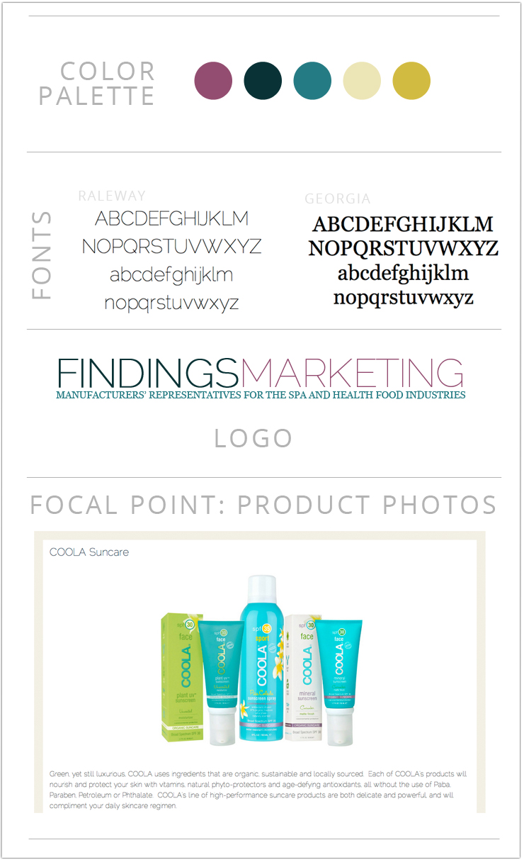
Anatomy of a Design

Project notes: Findings Marketing is a full-service manufacturer’s representative firm, working with organic, fair trade, and natural brands. Their old website wasn’t on WordPress, looked dated, and didn’t represent the professional work they do. They came to me seeking a sleek, feminine, clean design that would feature the awesome products they represent.
On a personal note, I was so excited to work with a company that held the same values I do that was also run by women. Fair trade PLUS woman leadership. This? Is a dream customer!
Services: Logo, website design and development (using the Genesis framework), and some light WordPress training.
Design notes: I created a color palette from the old site (which included a sunflower picture the owner hated), but brought it a little brighter with some teals and a gorgeous sort-of-mauve. Since Findings represents brands where the product photography is key, I wanted to really emphasize the photos with plenty of whitespace. Each product has its own branding and identity, so I didn’t want my design to overpower and clutter the page, which meant minimalism and simple lines in the design. Even the main font I used is light so as not to clutter the page.
Strategy notes: After chatting with them about their needs and realizing who will visit the site and what they ideally will do, I realized that navigation is key for this site – which means an extensive footer menu in addition to the nested menus at the top of the page. Lots of easy ways to connect with the team – the phone number at the bottom and a simple contact form – makes it simple to get in touch.
I have one more website or blog design opening till the end of the year. Get in touch if you’d like to work together!


I love the clean, modern look of this design!
Love this site. Beautiful work on this design. Clean, classy, simple and colourful!