(Yes, I am a dork.)
Your website should be like an extra employee. Who works non stop 24/7.
I recently overhauled my site after I realized it wasn’t totally representing what I do well. And that there was the potential to add more helpful information to potential clients. Since I am a referral-based business, not a Google-based business, most people are interested in working with me when they land on my site. The role of my site is to take someone from “My friend said they liked working with Ashley” to “Ashley can totally help me and my business through working on my website.” (You should always know what the main goal of your website is! It will drive all your decisions.)
Here is some of what I did:
Home:
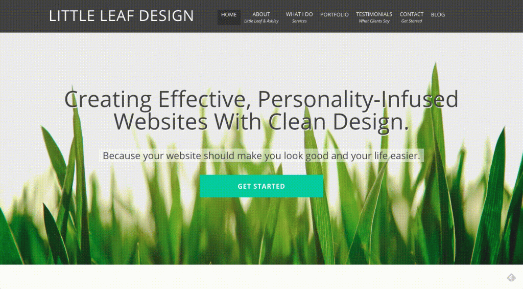
Instead of a short homepage with an intro and links to various things to check out, I added a portfolio section (with different types of screens showing my portfolio items instead of the plain old iMac), some more testimonials and benefits of working with me, what I do, and so on. People often scroll and click instead of read, so I wanted to offer plenty of info to consume right on the first page. As well as make it easy to find what they are looking for.
Portfolio:
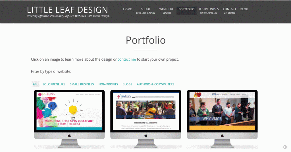
Instead of one static image for each project, I have a gallery of a few screenshots, or a gif of a screencast – it just depends on how the website is best shown. I also have a filterable portfolio now, so visitors can sort by type of project (non-profit, blogs, authors and writers, small business, etc). I added some new projects and removed some projects that don’t represent the kind of work I want to do any more. I still probably have too many items, but it’s so hard to pare down when I do such a variety of work! (Popular business advice is to “niche down,” or focus on a specific market. But one of my favorite things about what I do is getting to work with such a variety of industries and fields – one day I’m doing a church, the next day an author.)
Services:
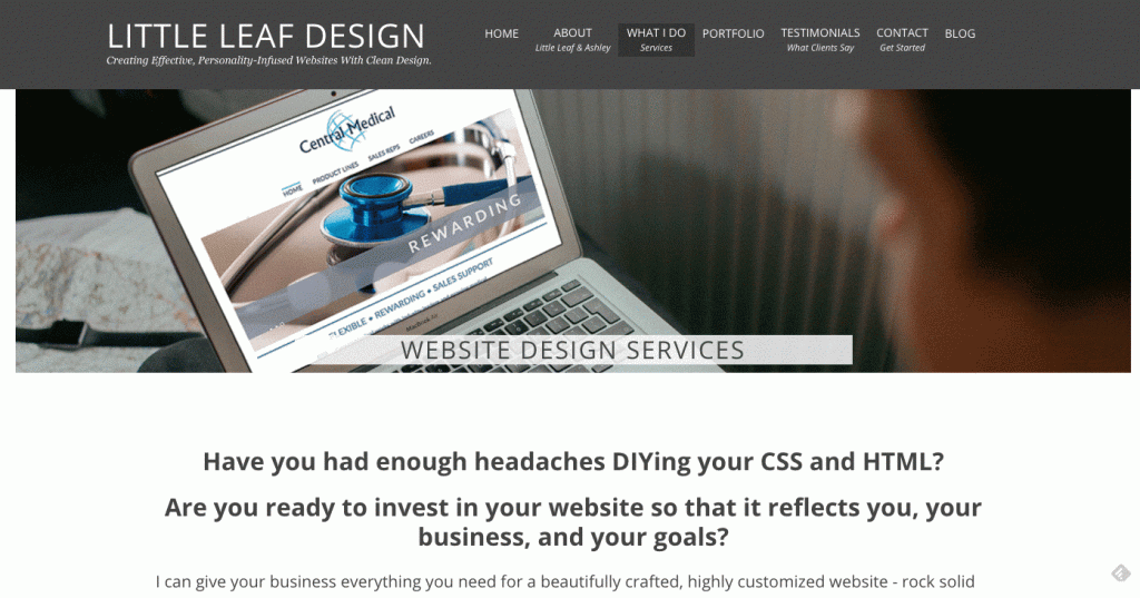
I tried to weave in more testimonials. I know testimonials and reviews often help me to trust a product or service I’m thinking about buying, so I wanted to be sure to include plenty on my site. And not just on the testimonials page. The truth is, I feel very confident in the work I do and my clients always are satisfied and happy with the end product – why not share that? A website can be a big investment for some people, and I’m certain that it’s a worthwhile investment. Which is why I don’t feel too salesy sharing what my clients have said about the websites I create and the experience of working with me.
I also changed the overall color palette slightly to be a little more modern and less cute, as well as fonts, logo, etc. Lots of subtle changes to overthink about. It was a good practice in taking myself through the process I’ve taken so many clients through – and a good reminder of how hard it can be, but how rewarding the end product is!



Leave a Reply