Hi Ashley,
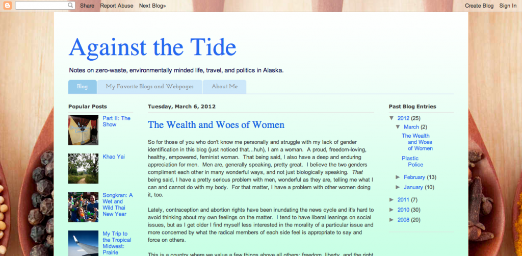
My friend referred me to your blog since we’re both no ‘poo users, and I love it! Your layout is great and I’m trying to clean mine up so as to attract a larger readership. Any tips on how to make it more user friendly and find-able? Thanks, and keep up the great work!
Thanks for the kind words, Hannah!
Design is a big part of keeping people once they hit your site. Yes, content is king! However, if your content is wonderful, but the reader can’t find more content to read because the design is garish or just not appealing, they will likely click away. And keeping them requires great navigation.
I design blogs, so obviously I’m a big fan of hiring a professional, but I’m also a big fan of everyone making their blogs a little easier-to-look-at. I understand that not everyone wants to, or can afford to, hire a designer, so I’d love to share some general rules of thumb to follow when thinking about blog design, navigation, and usability (you can deviate from any of these guidelines, I certainly have!, but they are fool-proof* ways to make sure your blog looks nice, and at the very least, not tacky).
Blog Design 101:
* No more than 2, maybe 3 fonts. More than this, and your site looks messy and chaotic. Restraint is good and looks professional.
* Choose a color pallete of 3-4 colors and stick with it. If you aren’t sure what colors coordinate, check out the favorites at COLOURlovers or Pugly Pixel’s Colour Lover posts.
* White space. Use lots of it. Instead of cramming as much information/photos/text/whatever into every square pixel of space, leave lots of room between the sidebars and the main column. It gives the eye somewhere to rest.
* Not too wide, not too narrow. Somewhere between 900 and 1024 px is my favorite design width. It’s viewable on the majority of screen resolutions (unless your blog is read by people with very old computers), but you don’t want your blog to be so wide that people have to scroll sideways to see it all. Same ‘not too wide, not too narrow’ rule applies to the main column and sidebars – I’d recommend no narrower than 150px for a sidebar. I like to keep my main column fairly wide because I post lots of photos, but each blog is different!
* Enable mobile view. Lots of visitors use mobile devices to visit blogs. Enable the mobile view in Blogger or activate a mobile plugin for WordPress.
* Make it easy to comment! I recommend disabling word verification and enable name/URL comments if you’re in Blogger. In WordPress, get the Askimet plugin to avoid spam.
* Keep the sidebars simple. Instead of cluttering the sidebars with every badge, widget, and blog button you have – consider moving them to a separate page. Keeping the sidebars from getting overly cluttered will provide more white space and less distraction from the content.
* Keep backgrounds simple, too. You can’t go wrong with white, a solid color, or a subtle texture or pattern.
* Never use white text on black background for your main content. Ever. Period.
* Or use auto-play music.
* Use photos in posts. It makes your blog more visually appealing. Of course, some blogs are more magazine-like and are practically all photos, while others are nearly all-text. I tend to blog like I read, so I prefer a medium amount of text with a healthy dose of photos. Do what you prefer, but know that people do enjoy having visual cues.
Navigation 101:
* Include popular or favorite posts in your sidebar. It helps people explore your site more – otherwise they might just leave after they read your post. You could also include a related links widget or plugin below each post.
* Search. So many times, I’ve gone to a blog looking for a past post – but without a search field, it often takes ages to find it! Help readers find past posts by including a search bar.
* Top menu. It’s the easiest way to direct your visitors to pages, learn about your blog, and so on. They are the universal method for navigation, so web users know to look for a navigation menu near the top of the page.
* Labels. Label your posts well to help readers find more posts that they’re interested in. It’s recommended to use no more than 12 – but I clearly break that rule.
* ‘About me’ on front page. A photo and a blurb about you is a great way to help the visitor immediately connect to you.
A few quick recommendations for your blog (which is great, by the way!) ::

– Define a color palette: the background and the content have very different feels.
– Consolidate the sidebars into one, move the content from the footer to the sidebar, and widen it to 250 px.
– More white space. I’d change from the green gradient in your content area to a plain white. Use some borders if you feel it looks to plain.
– The background stops after about 720px. I’d recommend either making it a static background (so the content scrolls and the background doesn’t) or change it and find a seamless background that doesn’t leave all that white space at the bottom.
– Make the header more eye-catching. It’s great that you have a tagline that gives the visitor a sense of what to expect on your blog, but sure it does so visually as well. Perhaps use a different font or color or find an image – the header sets the tone for your page.
– Create a sidebar widget with a few sentences about you and a photo.
– You asked about becoming more findable – comment on blogs where you think the readers would like what you write about. If they like your comment, they’ll follow it to your blog and read it! (A huge number of outclicks on my site come from readers clicking on other readers post titles in the comments section). Also, post regularly so when people visit, they know it’s an active blog.
Good luck and I hope this helps!
* Disclaimer: Our Little Apartment does not guarantee that messing with your own blog code will end well. Further, we do not guarantee our advice will ensure that you blog looks good. Please consult a professional if you have any questions about your blog design.


Great suggestions, Ashley. I just realized that my own blog doesn’t have a search bar! (Who should I blame for this? Wink, wink, <3) I'll have to figure that out. But seriously, I'm speaking on a Blogging Basics panel at the end of the month, & this is a great checklist to have on hand of things I'd like to remind newbies about. I may be putting together a handout for attendees – mind if I link to this post? Credit to you, obviously.
PS: As an FYI to the more liberal among your readers regarding ColourLovers: http://linzlovesyou.com/2012/01/why-im-boycotting-colourlovers/
I would also add social networking icons to my blog. That will have the same style as my design. It is so useful to integrating your blog witg Facebook and Pinterest and Tweeter.
those are some great tips, ashley! :)
Great tips. Now I just need to teach myself how to add the facebook and twitter things… Always a learning experience, but a fun one.
Thanks for the tips! I am slightly embarrassed at the tackiness of my blog at the moment. Would you say it is a bad thing to have layouts that match the season? My guess is yes! Do you recommend any sites that teach you how to add a search bar and some of the other suggestions you mentioned? I would really like to add some of those things, but I don’t know how and I can’t afford a block make-over at the moment.
p.s. Thank you for adding an edit option! Sometimes I make mistakes when I post a comment!
Thank you so, so much for your wonderful words of advice. I’ve already done an upgrade. Hope you and your readers like it!
Travelers’ heaven is the localize where you can find easily the first protection in apartments.