Every few months, I like to share what I’ve been working on with you all. Design is a big part of my life these days! I spend nearly as much time doing design work as I do working at my day job. I’m learning more about the nitty-gritty, not-as-fun details of business ownership – BUT! I still get to spend most of my time elbow-deep in Photoshop, Illustrator, and InDesign, so I’m a happy, happy girl.
Check out what I’ve been working on in the past few months:
Catholic Drinkie
Platform: WordPress
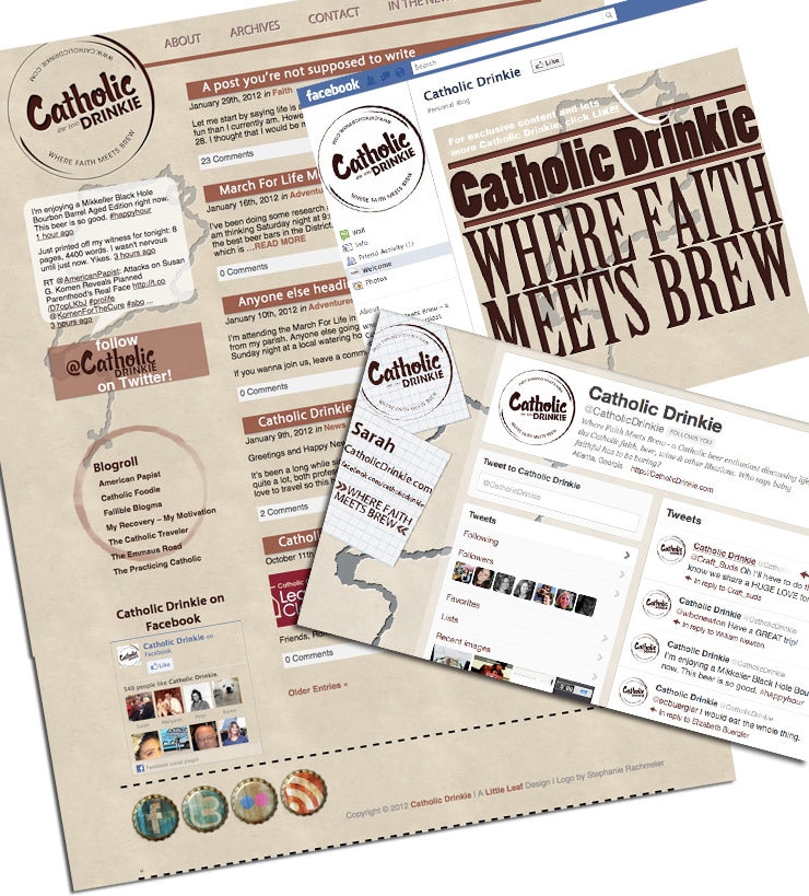
Sarah, the founder and blogger behind the blog Catholic Drinkie wanted a new look for her blog and coordinating social media pages. She liked a vintage poster feel and didn’t want it overly feminine (boys drink beer, too!). With a brown and maroon color palette, creating an embossed look with a few elements , and using a poster-like texture, I think we’re both excited about the way it turned out. Check it out here.
Bite Buff
Platform: Blogger
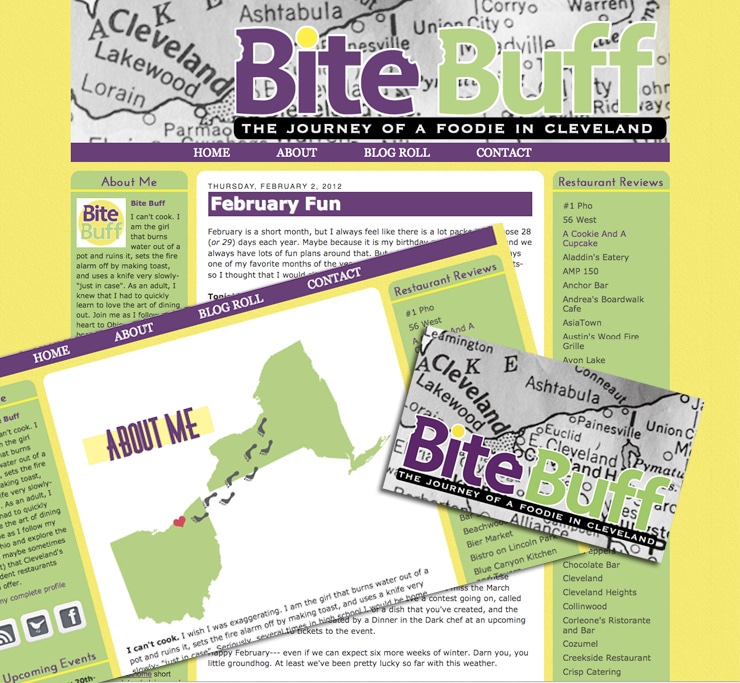
Katrina wanted to take her food blog and make it bright and colorful. Well, bright it is! She is a Cleveland-based blogger, so I wanted to anchor her header with a photo of a map of Cleveland. I also designed coordinating business cards and an about page with a sweet graphic indicating her recent move from New York to Cleveland. Check out her blog here.
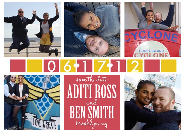 Aditi and I go way back. As in, we both lived in Bangkok, Thailand in middle school in the late 90s. True story. She also introduced me to the TV show Friends, for which I am forever grateful. I love working with people I know in real life and it’s even more wonderful when the internet and blogs bring old friends back into my life! I got to see Aditi for the first time in, oh, 14? years this May when we went to New York. It was fun. Aditi and Ben are fun. Aditi and Ben are celebrating their marriage with friends and family and wanted a fun save the date. This makes me want to go find a carnival! (Aditi has a blog. You can stalk her and her exciting NYC life here.)
Cleveland’s A Plum
Platform: Blogger
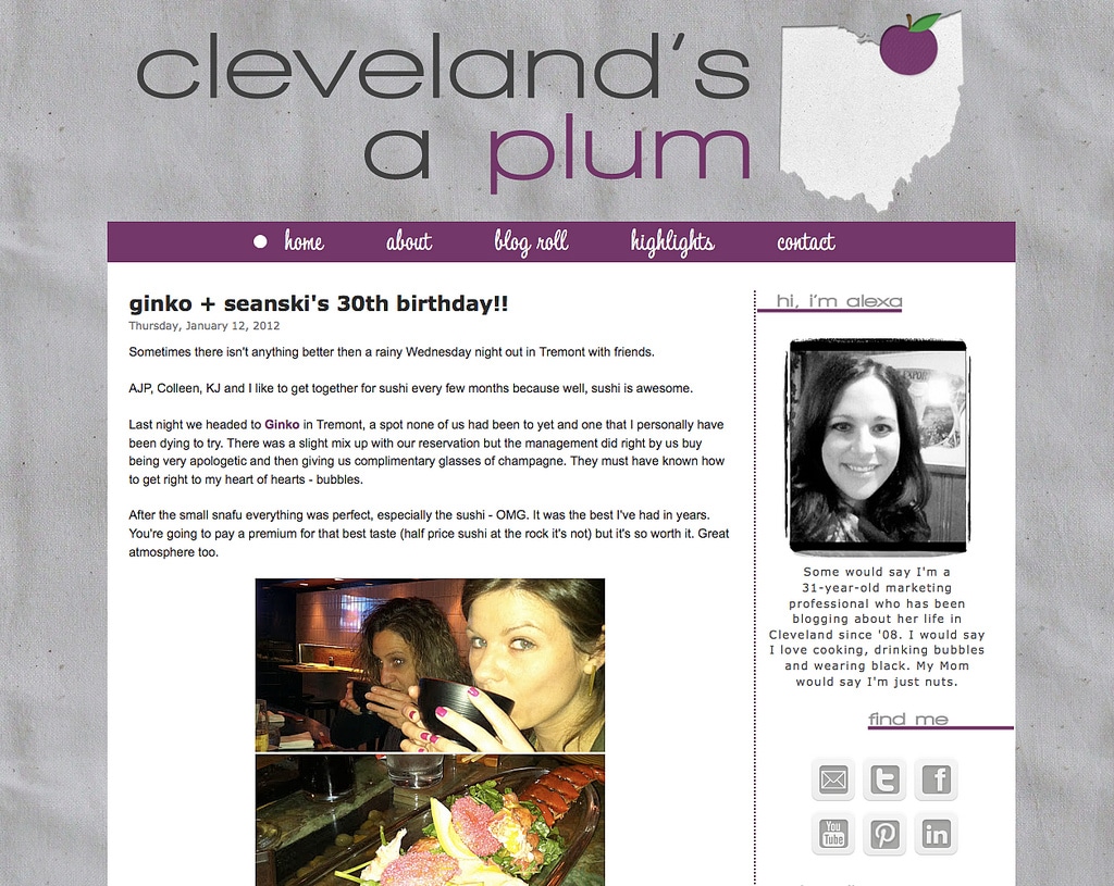
I mean, who doesn’t know Alexa from Cleveland’s A Plum, amiright? The girl has been voted best blog in Cleveland for several years in a row and is über popular. Alexa wanted to move away from the super-pink to something a little more mature. With a linen texture background and a simple Ohio with a plum (literal, but not too cheesy), it’s sleek and professional, but still fun. Like Alexa. Check it out here.
The Dawg’s Dish
Platform: WordPress
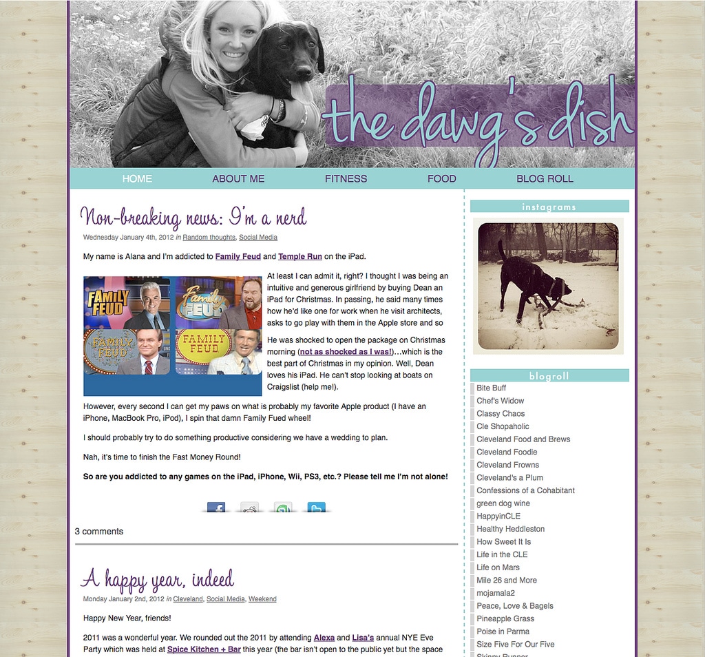
When Alana contacted me, I was so excited to do another Cleveland blogger’s design! I used a photo of her and her dog in the header, typography in the post titles, a wood texture for the background, and sparse use of her color palette with plenty of white space to create a clean and simple, yet unique, look for The Dawg’s Dish. Check it out here.
What Bex Loves
Platform: Blogger
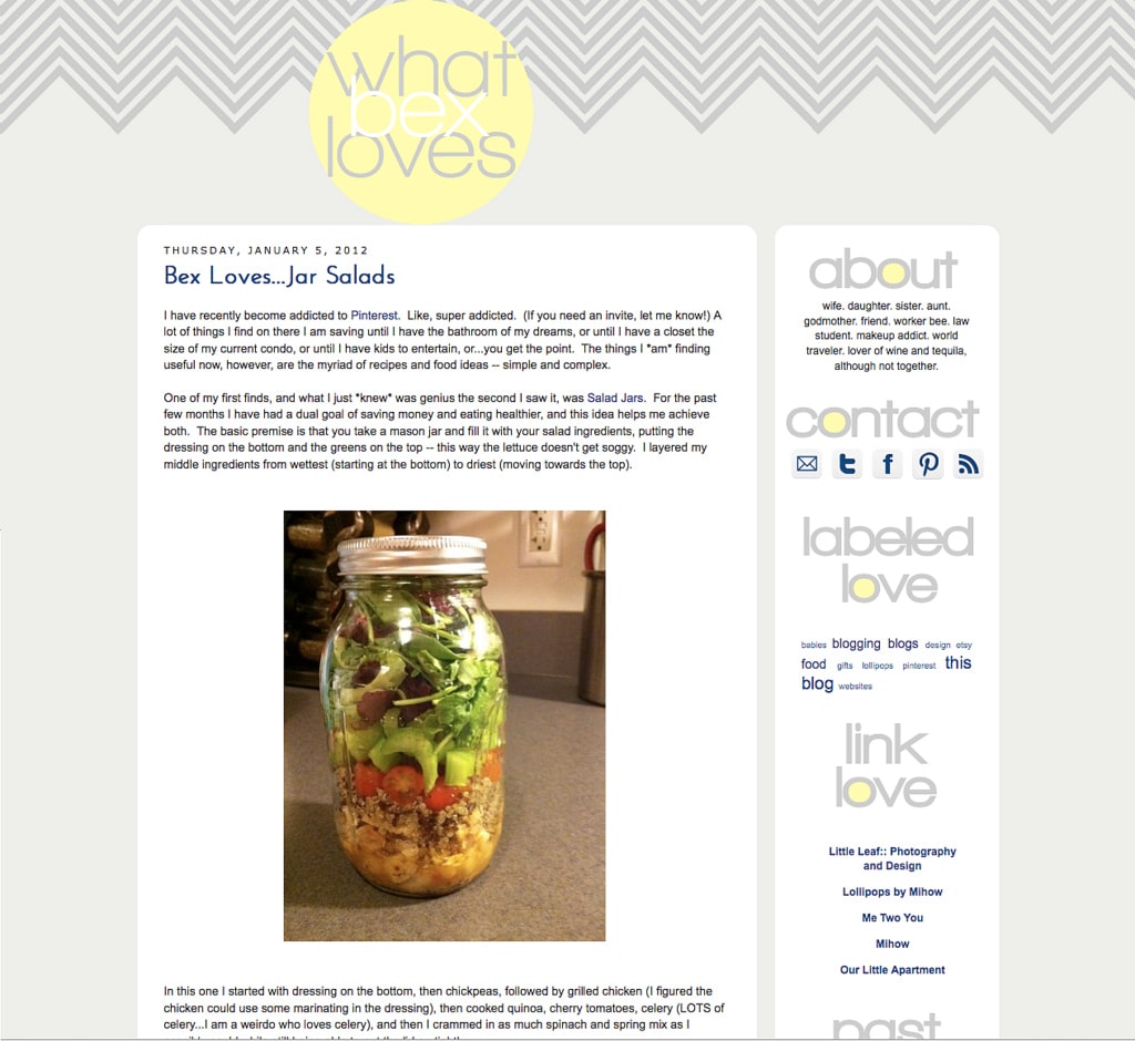
Becky was starting a new blog and wanted something airy and light, with a pop of navy. She even made a Pinterest board for her tastes, which was incredibly helpful. In fact, Becky was also THE easiest client ever in the history of anyone. She responded to email with actual decisions in, like, 30 minutes. And she liked everything I did. It was awesome. Dream client. And I actually adore the blog design and it’s something I’d love on my own blog! Check it out here
/ / / / / / / / / / / / / / / / / / / /
It’s been six months since I started Little Leaf, and about three years since my first blog design gig for someone else. As it happens when we grow in any skill, I am now amazed at how absolutely awful some of my very first designs were.
I continually take gigs that stretch me just a little bit. Where I don’t 100% know how to do every aspect. Where I learn on the job. And it’s helped me grow incredibly. Oh, yes, I still spend hours wrestling with code. But, fewer hours. And my work is finally, finally matching my tastes. Every time I’ve made something, ever, I’ve been proud of it. But sometimes, I’d look at it later and think, “It’s not as good as I know I can be.” And now, that gap between what I want to do and what I’m doing is shrinking. Much I like I mused about last September.
Anyway. Thanks for always being my biggest fans and supporters, friends. It means a lot.
xo


Thanks for the shoutout! You did amazing work and it was truly a pleasure to work with you. You better believe I’ll be referring people to you!
Thank YOU for working with me. :)
LOVE.
Thanks! :) That means a lot.
I LOVE your work!
I need to email you – i’m designing a blog for a friend of mine in thesis in WP and there’s a few things I’m stuck on (like changing the font style in the post titles) that maybe you have some advice on how-to’s – self taught coding is so frustrating sometimes :(
Agreed! You can look into typekit if you want to use some different fonts – only a dozen fonts come native to web design.
great blog design work as usual!!
Thanks so much! :)
Thank you so, so much for the amazing Save the Date! We have received nothing but wonderful comments about how great it is. You are the best!
Hey Ashley, these are really lovely. I’m a former blogger who’s just starting up a new blog again after a year and a half hiatus and I’d be interested in getting it designed by someone like you who knows what the heck they’re doing. Could you email me about pricing and what’s involved?
Ashley these are gorgeous!! Good work! You are making me want a redesign BAD.