Perks of Being a JAP // WordPress Design
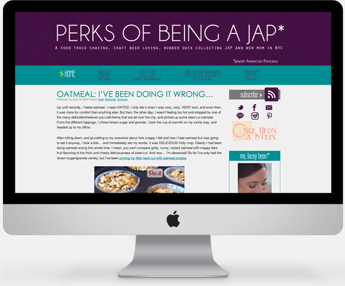
Lacey is a longtime blogger, new(ish) mom, and NYC gal who wanted a new look for her blog. (This is when I wish I remembered to take before screenshots.) Her old blog was sweet, but I wanted to go for something more bold and fun – just like Lacey.
After developing the color palette and some font choices for her site, The bold header grabs the readers’ attention, but the rest of design isn’t so loud that it distracts from Lacey’s content. (Always important on a blog – it’s about the BLOG, not just the design. Content is king and all that.)
To tie the header into the site, the sidebar widgets somewhat reflect the header in the layout, uppercase letters, and block of color. The hover effect on the navigation menu added a touch of fun, with the hand-drawn lime green asterisk. There’s a reason for everything in design. Who knew, right?
Lacey is as about as easy-going a client as I’ve ever met. I loved getting to work with her on not only her blog, but also her beer blog, Once Upon A Stein.
Wanna work together to make your site awesome? Let’s do it!


Yayyy!! I am still getting compliments on my redesign… I don’t think any other design I’ve had on my blog has received such positive feedback! And I’m glad you think I’m laid back – I thought I was such a pain in the butt!
I love that the color and fonts pretty much define the look of the blog. There’s something to be said about simplicity.
Wow, great design! I know where to go when I’m looking for a blog design :)
My blog is very new, so that won’t happen for awhile, but I love your work!