Anatomy of a Design

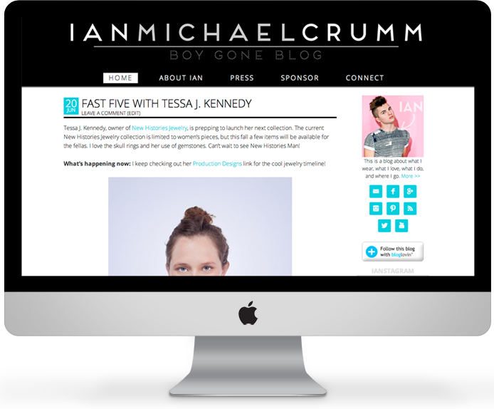
Project notes: Ian is an up-and-coming fashion blogger with a rapidly growing readership. He wanted to move from WordPress.com to self-hosted so he could start to monetize his blog with ads, and in the process, decided to get a major upgrade to a custom site design.
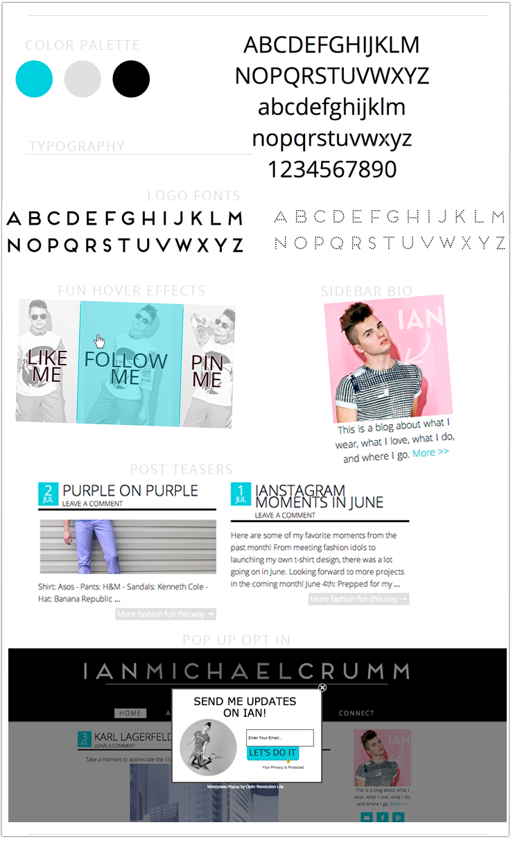
Design notes: To really showcase the fashion photography, I used a plenty of white space with a simple color palette. Strong sans-serif fonts are modern and slightly masculine with their clean, simple lines.
Strategy notes: To drive readers to his regular features, I created image links in the footer and included his categories in the sidebar (this works best when bloggers are consistent with the categories and don’t use dozens and dozens of them…like me. Oops.). The footer of a single post page includes an email newsletter sign up, which is also in the sidebar and a popup opt-in. Might be overkill, but it will surely lead to an increase in his email list. A quick note on popup opt-ins – they are much loathed by some, but definitely effective. I changed the settings so that it will only popup once a year per user’s browser so as not to annoy folks too much.
It was all built on WordPress, of course.
Project notes: Lauren is an actress and a model who wanted her website to have a professional online presence that would allow friends, family and (most importantly) industry professionals to access information and updates regarding her acting career in Los Angeles. She wanted her online presence to reflect who she is both as an actor and as an individual. She hoped it would be personable, accessible, easy to navigate and visually stimulating.
Services: Logo & branding. Front page layout with a slider, welcome message, portfolio teaser images, and blog post snippets. She has a gallery with thumbnail collections from various photo shoots, as well as a contact form.
Design notes: To really showcase Lauren’s gorgeous modeling photos, I used plenty of white space (which was a feminine peach on this site) and large, attention-grabbing images. A strong sans-serif font with its clean, simple lines was paired with a light serif fonts for headlines and contrasted with a feminine script logo font.
Go check out his site!
. . . . . . . . . .
If you’re interested in working with me, I’m currently booking clients.


Leave a Reply