Anatomy of a Design

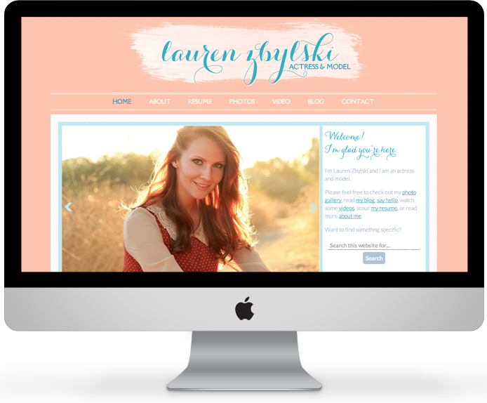
Project notes: Lauren is an actress and a model who wanted her website to have a professional online presence that would allow friends, family and (most importantly) industry professionals to access information and updates regarding her acting career in Los Angeles. She wanted her online presence to reflect who she is both as an actor and as an individual. She hoped it would be personable, accessible, easy to navigate and visually stimulating.
Services: Logo & branding. Front page layout with a slider, welcome message, portfolio teaser images, and blog post snippets. She has a gallery with thumbnail collections from various photo shoots, as well as a contact form.
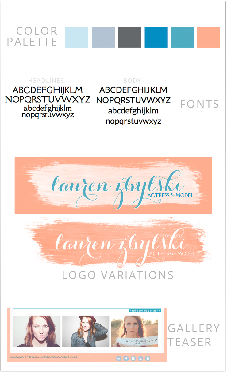
Design notes: To really showcase Lauren’s gorgeous modeling photos, I used plenty of white space (which was a feminine peach on this site) and large, attention-grabbing images. A strong sans-serif font with its clean, simple lines was paired with a light serif fonts for headlines and contrasted with a feminine script logo font.
Strategy notes: To drive visitors to her modeling photo page, I created a gallery teaser in the footer and included his categories in the sidebar. It was all built on WordPress with Genesis as my framework, of course.
Go check out her site!
. . . . . . . . . .
If you’re interested in working with me, I’m currently booking clients for September!


I love the site you made for your client! And of course, as my favorite blogger, I love your blog and website. I suggested your business to my older sister, who is also L.A.-based. She is starting a new career in the event planning business; I told her whenever she gets up and started, she may want to consider you for a possible website. I gave her the link to Little Leaf Design. I hope your business continues to grow, and I pray and hope for blessings for a better 2013 and beyond for you and your family!!!